Case study CFF Maestricht
CFF Maestricht is a highly personal script font, carefully crafted from the handwriting of Maastricht-based film producer Jean-Paul Toonen. His handwriting is very dynamic, artistic and a tasteful blend between roman and italic style. Perfect for elegant and beautiful artwork.
CFF Maestricht is our joint gift to the beautiful city Maastricht.
Jean-Paul Toonen is a film producer from Maastricht who introduced his handwriting in 1992. At that moment Maastricht was writing history. The European Treaty and it’s subscribers inspired Jean-Paul to design this handwriting. ‘Maestricht’ is his handwriting that was originally written with the iconic Montblanc Meisterstück 149 fountain pen.
René Verkaart is type director at Characters Font Foundry, a Dutch font foundry located in Maastricht, The Netherlands, and Düsseldorf, Germany. He crafted the handwritten texts into a digital, smart, living font.
The story of Jean-Paul Toonen
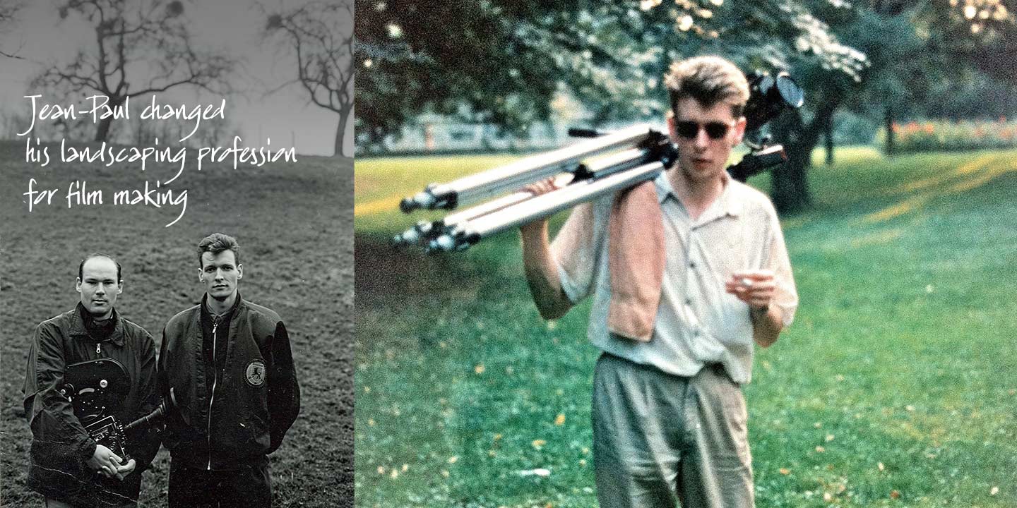
Already during his landscaping education, Jean-Paul Toonen experimented with his handwriting. Making readable captions on design drawings was time consuming, and he had little desire to haggle with font templates and Letraset rub-on transfer letters.
Landscape designers often work with drawings, explanatory texts and notes about texture, size, space and color. A handwriting for landscaping plans and design implementation must comply to the highest possible readability. The planner can not afford that a contractor misinterprets his scribble.
This led to a complex and extensive handwriting. Over the years, it became more and more disciplined and streamlined, but it retained its original character. When Jean-Paul changed his landscaping job for film making, his handwriting quickly adapted to this new, fast profession.
Jean-Paul’s extensive bookcase holds more than two running meters of notebooks he wrote in the last 30 years. There you will find lots of sketches, but mainly handwritten notes, swiftly trusted to the paper with his beloved Meisterstück fountain pen. For a period of 25 years, this fountain pen accompanied him on his journey to cities all around the world, as well as in his hometown Maastricht.
Slow writing
Jean-Paul sees his handwriting as a means of reflection. “He who writes with the appropriate slowness will choose his words more carefully” says Jean-Paul Toonen. “Thoughtfully writing down the words, while contemplating about how to continue the letter he’s writing.”
It’s not for nothing that in ancient Asia, writing itself became an art form. Each character requires both craftmanship and artistic skills that can only be achieved with full attention and devotion.
He who writes with the appropriate slowness will choose his words more carefully. Thoughtfully writing down the words, while contemplating about how to continue the letter he’s writing.
Writing at a young age
Toonen says: “In fact, we should pay much more attention to drawing and writing in elementary school. It would make our children realize that the skill of thoughtful writing is a special gift, rather than an annoyance. And that our words are then valued when they are written clearly and flawlessly. That’s why I think it’s so nice that René created the fonts CFF SidB (Writing in the Elementary School) for the Netherlands, and CFF Plantyn for the Belgium national educational institutions. Both fonts are lovingly crafted to teach children writing.”
Where our journey began
Jean-Paul Toonen and I meet each other regularly to exchange ideas and discuss news. So also this sunny day. We met in a cafe in Maastricht, drank coffee and ate a sandwich. Suddenly Jean-Paul put an envelope on the table. Three lines of text were written on it that magically attracted me. I was hooked, right then and there. That’s where our wonderful journey began to craft a custom font together from Jean-Paul’s handwriting.
Jean-Paul’s handwriting is enchanting, intriguing and memorable. With its passioned swooshes and a blend of upright and italic characters, it’s a real eye-catcher. People that know Jean-Paul are fascinated by his handwriting. No wonder that he regularly has to write invitations, eulogy and Christmas cards for friends and clients.
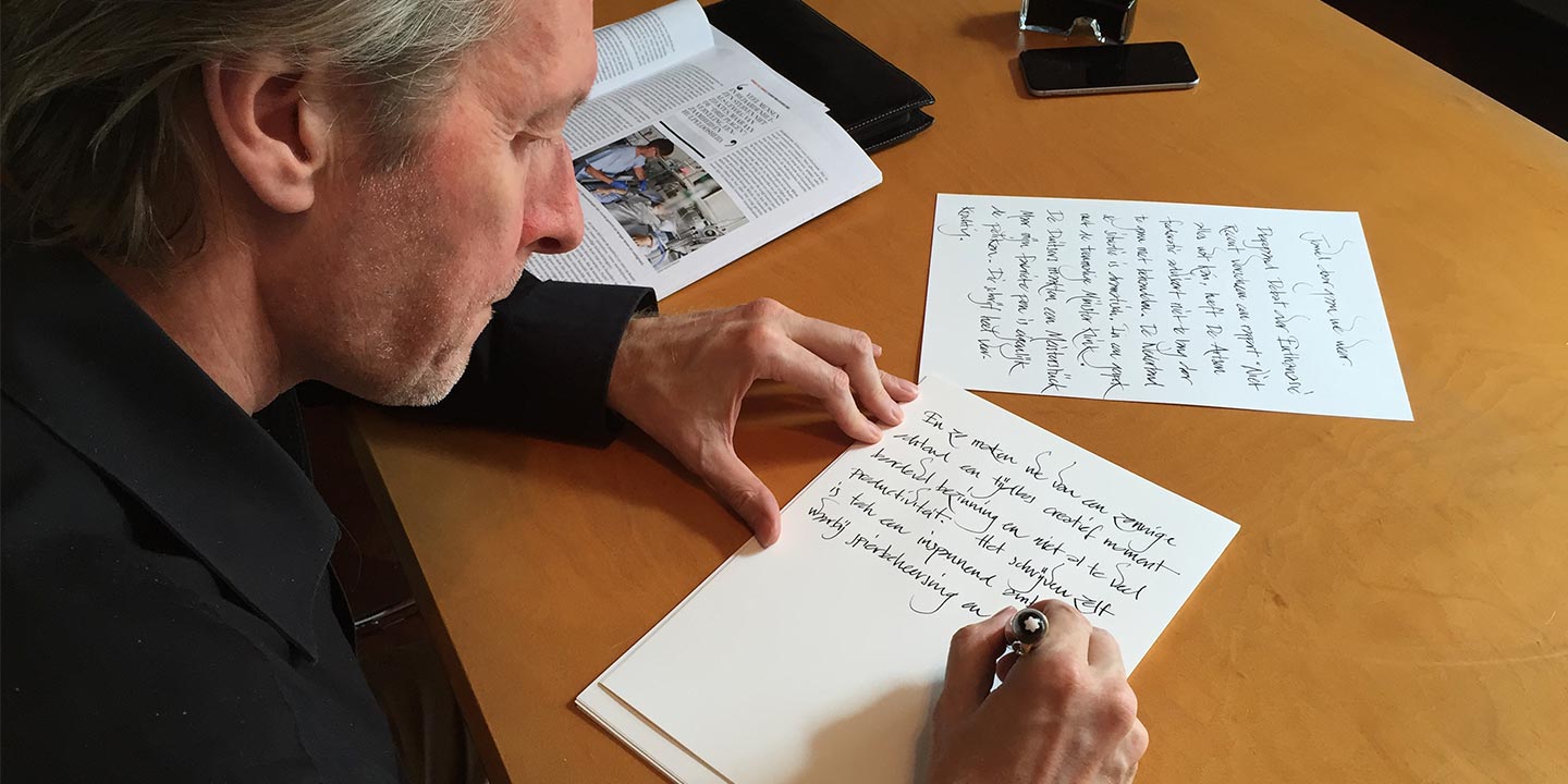
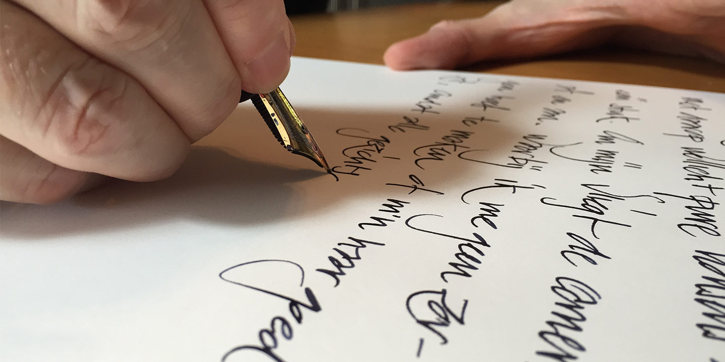
The lettering is originally written with the iconic fountain pen The Meisterstück 149 by Mont Blanc, Vienna. That’s a deep black precious resin pen with gold-coated details, surmounted by the white star emblem and finished with a handcrafted gold nib. The Meisterstück evolved into Montblanc’s design icon.
Jean-Paul fills his pen with Montblanc Midnight Blue ink or he mixes his own blend from black and blue to create an even deeper blue color. He buys his notebooks directly at Papier Plus in Paris, or he orders the beautiful Japanese Midori notebooks from London.
Digitizing the handwriting
Digitizing the handwriting is a critical moment. Three parameters determine the end result:
- The character of the handwriting: What level of details should be kept, so that it does not become a weak copy of the original?
- The texture of the pen and paper: How many fine details should be kept, and how much of it will you actually see it in the digital font?
- The size of the font file: Letters with a lot of anchor points sometimes make the font unworkable in graphics programs. Reducing points keeps the font mean and lean.
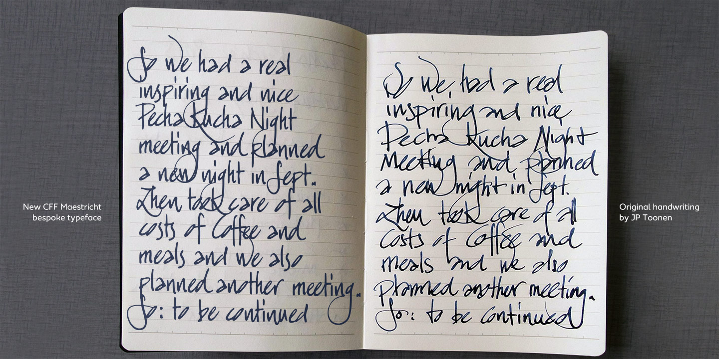
We have chosen a low-tech digitization approach because we believe that the style of the handwriting is most important, and not so much the texture of the pen and the paper. As a result, the font retains sufficient detail and character and is a true lightweight under the handwritten script fonts.
Carefully orchestrating the font
The handwriting looks very irregular, but if you look carefully, it’s actually not. It has rhythm and flow, but certain letter combinations are consistent enough to function as the backbone of the font. It’s not just the shape of the letters but the arrangement of words that makes the text pop.
By carefully selecting the correctly shaped letters we were able to make a digital version that is almost identical to the original handwriting, but still works well as a digital font, says René Verkaart. This way we preserved the flow, quirkiness and originality of the handwriting. We could connect certain letters in one combination, that would also work well in another combination. The alternate letters, swashes, and finals make the font really come alive, making it random enough to look realistic. This was a hell of a job, but we’re very proud we pulled it off.
Our font for the city Maastricht
You can only issue your own handwriting once in your life. That’s why Jean-Paul supports René with al kind of glyph variations. All the effort gives a good feeling, and is in favor of anyone who wants to create something beautiful with this font.
Jean-Paul called it ‘Maesticht’, because of his many personal connections with his town. He runs his film company T36, organizes TEDxMaastricht and is involved in local neighborhood and school initiatives. But most of all he chose the name Maesticht because this city – well known for the European Treaty, violinist André Rieu and its history dating back to the 12th century – doesn’t have an own handwriting. Until now!
Maastricht has archives full of manuscripts, stored in the Regionaal Historisch Centrum Limburg. Sometimes beautiful reports of justice, recorded in detail by lawyers. Mostly written historical documentation of Maastricht and the Limburg region.
All this has been preserved from the time when writing was something very special. What remains from our current digital age is uncertain. For Jean-Paul a good reason to stick to his fountain pen and dark blue ink, for all personal notes and letters. Besides that, a Montblanc Meisterstück is a joy forever.
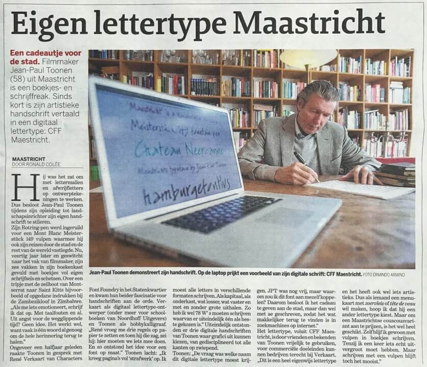
Newspaper article De Limburger
September 27th, we found our font in the newspaper De Limburger. The article was written by journalist Ronald Colée, the photo shot by photographer Ermindo Armino.
My cooperation with René was very unique. He crafted my personal handwriting into a digital font, as if a surgeon gave me a bionic arm. What struck me: René is always very positive, because he does what he loves most. His talent, his fascination and skills are in line. And that makes René an experienced professional that creates energy from cooperation. Developing my font – the CFF Maestricht – was a complicated process, which put our joint effort to the test. But I only experienced joy. René is very precise, leaves nothing to chance, and takes every step of the process seriously. And so it should be in his profession. A man with taste, commitment, experience and ideas.
Jean-Paul Toonen
We hope you enjoy using our font CFF Maestricht, printed in dark blue on invitations, diplomas, and manuscripts. But preferably, it’s seen on drawings and maps, in designs and concepts. How Maesticht originally originated.
Jean-Paul Toonen & René Verkaart
Buy CFF Maestricht
You can buy CFF Maestricht directly from us or from one of our resellers that you like best.
Your own custom typeface
In a world that is exploding with brands and loud advertising noises, companies make every effort to stand out and be unique. A custom typeface is a very powerful visual tool to effectively position a brand. They are tailored to a companies needs, and can even save money long-term. It’s no longer exclusively available to large companies, but can be done at a smaller scale for medium sized companies as well.
Characters Font Foundry offers creative and highly distinguishable custom typefaces that gives your brand a competitive edge.
Contact us for more information about the Custom Type Services and prices.