Case study CFF SidB
CFF SidB is a custom typeface we created for Noordhoff Publishers. SidB stands for ‘Schrijven in de Basisschool’ (Writing in the Elementary School) and is an independent method to teach kids in elementary school writing. It is unique since it is the only not-connected method that works equally well for left- as for right handed children.
Noordhoff Publishers approached us with a very exciting request: can you assist us by creating a typeface for our educational method, to teach children writing in elementary school?
You might not expect it, but the elementary school is probably the first place where children become aware of typefaces. When your child learns to write, they copy a typeface that shows them how this works. So we were genuinely excited to be commissioned the job and create a custom typeface for Dutch kids to learn writing.
Elementary school writing method
By approaching the different aspects separately, the elementary school writing method teaches children to be able to view and develop their own handwriting. The method is based on a natural structure and places emphasis on the motor development. The children achieve one small success after the other, which works very motivating. Certainly because the child learns to write in the style that best suits him or her.
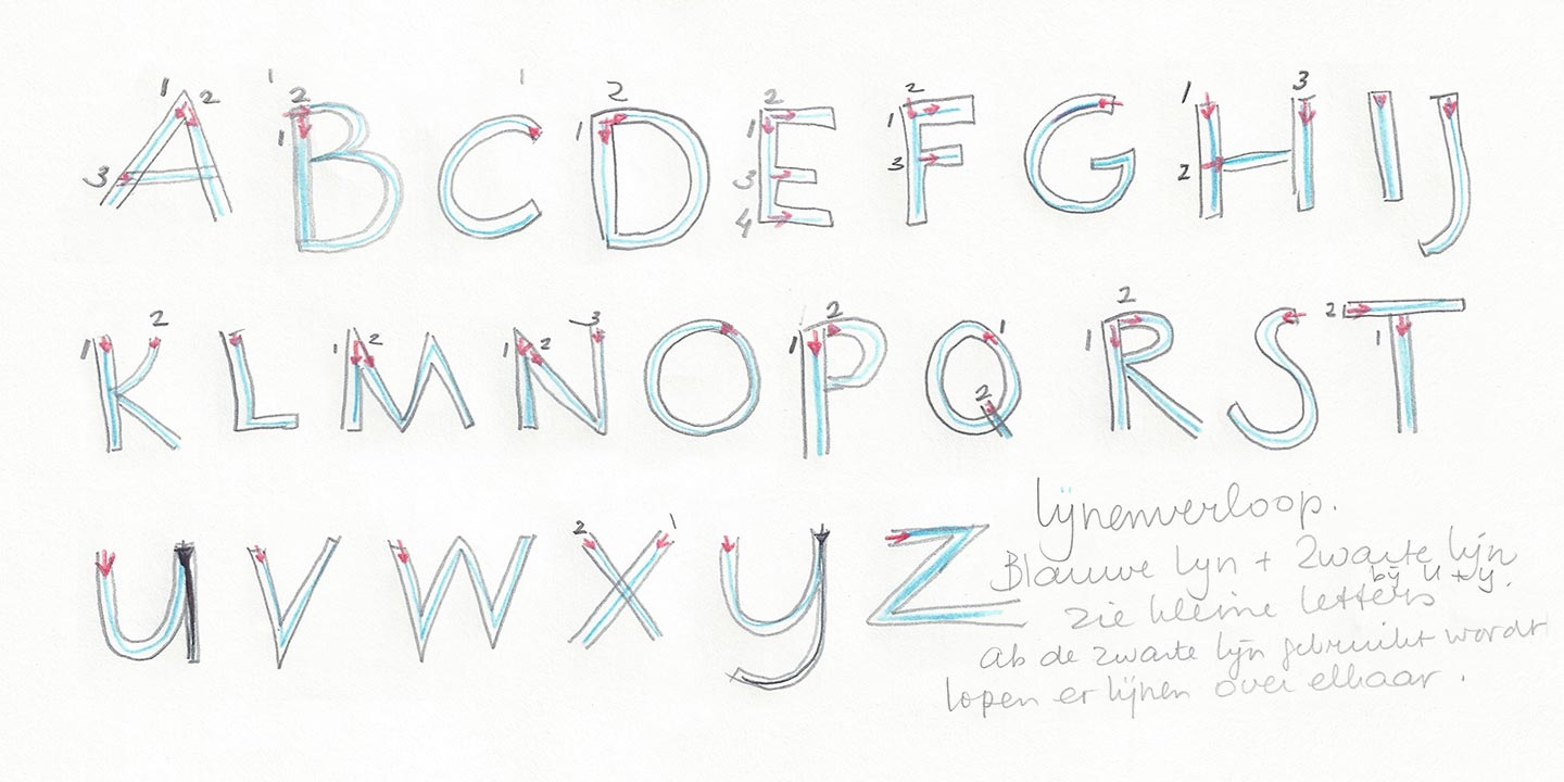
Corrie Smetsers, the author of the writing method, explains that the manner in which the letters are written is important to the form. The structure of the connected handwriting is the basis for SidB’s not-connected handwriting.
Interview with Corrie Smetsers
How did you get the idea for the font?
It was not my idea at all. I would never have thought of it if I didn’t get a commission from Chris Brand (1921-1998) 25 years ago. “You are going to make that method and you’ll write the letterforms. Time will be ready and only you can do that”, he said.
It was about the method Rhythmic Writing, based on the font ‘Italic’ that Chris made in 1958. It never really worked, by the way. He was very frustrated about this, I believe. He gave me the English ‘Beacon Writing’ method as a guide. The difference between Beacon Writing and Rhythmic Writing was that Rhythmic Writing was connected from the beginning, and Beacon Writing first taught disconnected folllowed by a connected method.
I had received an assignment and more or less promised that I would do it. A promise is a promise. That was engraved into my soul, so I went out on this special journey.
How did you end up working with Noordhoff Publishers?
Well, you know how that goes. Meulenhoff Publishers did not pick up on it and I fell of the radar. Zwijsen Publishers sent me out the door. Since I’m a fool for education, do not talk much about money and just follow my vison, I found a great partner in Noordhoff Publishers.
How long have you worked on this font?
Disconnected writing has always been in the back of my head. I wanted to combine it at Noordhoff Publishers right away. But only when the connected method became successful I could get started on it, quickly! It had to be ready for the NOT fair in January, 7 months from from the start.
So 25 years later I start making the font. I had a clear idea: start disconnected, and connect later on (Beacon Writing). I had heard of new techniques, but came across the wrong people. Noordhoff waited for the final result and had no idea what was going on. The last thing they came up with was that I would have to make the font with a professional type designer.
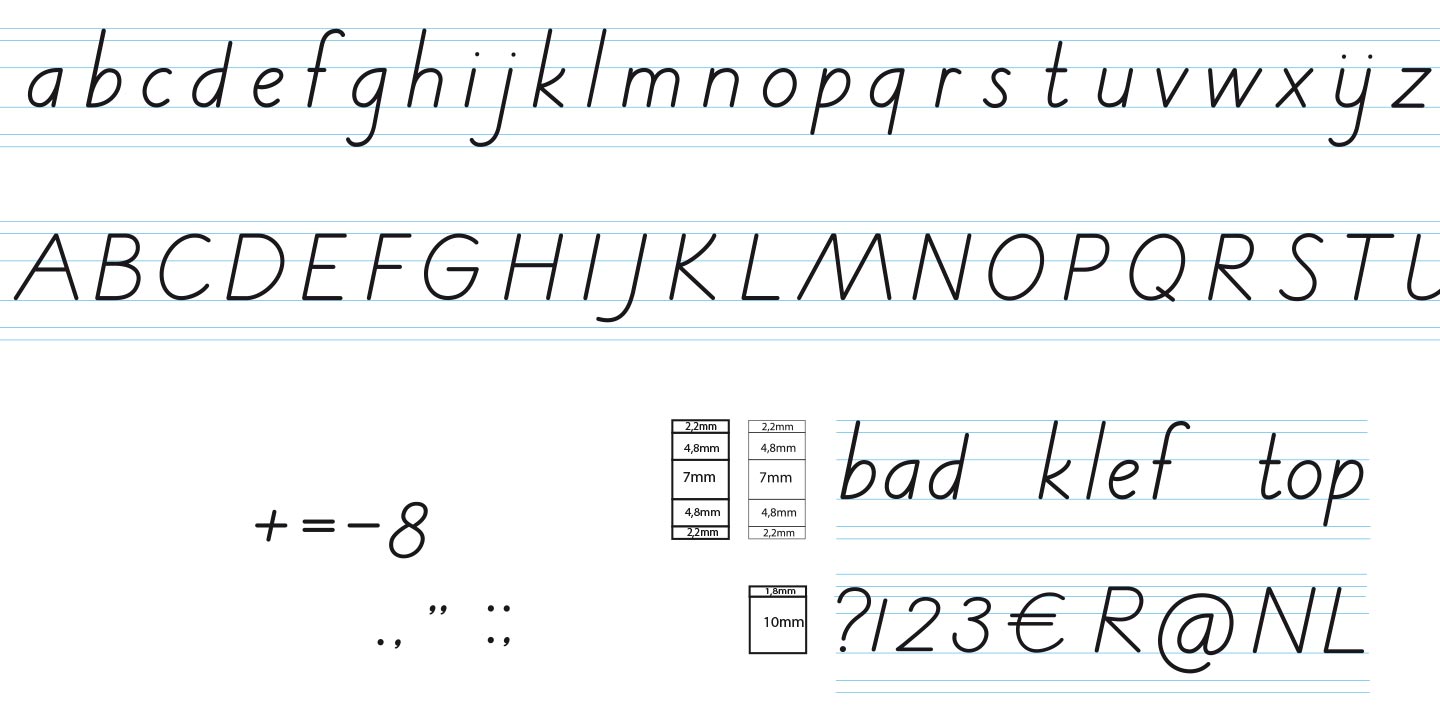
My plan was fixed; it shoud be a well executed ‘Italic’. The white space should be particularly visible in the a b d g p and q. That was my style, as I had also published in Leren Kalligraferen (Learning Calligraphy, 1980), a book that I made with Martin Keulen. His theory, my texts.
Is this disconnected writing really new?
Disconnected handwriting is new now. The name is new, the implementation in primary education is new. The letter forms and the concept are based on the Italic, disconnected followed by connected writing originates from Beacon Writing. The motivation is Chris Brand, without a doubt.
Due to cutbacks at Noordhoff, disconnected writing became new, since there was no budget to have connected letterforms for the higher grades. Children will eventually connect anyway, so I could implement my ‘Los Schrift’ method to its full extend.
As a graphologist I can’t really praise the disconnected script. My didactic manifesto is as follows:
My ‘Los Schrift’ (Disconnected Writing) method is initially not-connected handwriting. If the child wants to write connected, there is an extensive didactic treatise, so the teacher can expertly guide the child to a fast-written, easily legible, (partially) connected script.
Can you tell us more about your history?
Anyone who wants to write, to communicate, wants to be able to write legibly. Replacing the handwriting by writing ‘on the computer’ seems an option. My conviction is that ‘writing’ on the computer will have a place next to the handwriting but will never replace this.
Book: Schrijven is een vak apart: schrijven & didactiek, 2001
Noordhoff Publishers
Noordhoff Uitgevers is the largest educational content and services provider in The Netherlands. The company covers a broad subject range within its primary, secondary, vocational and higher education teaching resources. Hundreds of specialist authors collaborate to develop up-to-date course materials to help students and teachers achieve maximum results. The market leader also offers, with the business unit Noordhoff Health, e-learning for the professional healthcare market.
Noordhoff Uitgevers serves the entire Dutch learning community. Home learners and professionals, as well as schools, benefit from a comprehensive combination of content, services, and tools.
What the client says about us
“During our first meeting, I realized that René was the right person for our assignment. His knowledge of typography is huge. Yet this was not an easy task: developing a typeface, with the primary goal to teach children to write, is another discipline than a typeface used for print. René has entered the job with an open mind. The close cooperation with our author and creator of the writing system Corrie van Eerd, has resulted in a brilliant font.
René, you’re someone I highly recommend. Your flexibility, empathy and the urge for perfection are your enormous added value.“
Maurice Perdon – Business creator in the role of publisher primary education
Your own custom typeface
In a world that is exploding with brands and loud advertising noises, companies make every effort to stand out and be unique. A custom typeface is a very powerful visual tool to effectively position a brand. They are tailored to a companies needs, and can even save money long-term. It’s no longer exclusively available to large companies, but can be done at a smaller scale for medium sized companies as well.
Characters Font Foundry offers creative and highly distinguishable custom typefaces that gives your brand a competitive edge.
Contact us for more information about the Custom Type Services and prices.